CursorCursorCursorCursor

Primark » Shaping a global fashion superbrand

« Back to work
  • Brand ID
  • Campaign
  • Production

As a trusted creative partner to Primark for over eight years—and counting—we’ve been on quite a journey together...

When we first started working with the team at Primark, the only distinctive brand assets were the logo and an aqua Pantone swatch.

Over the next nine months, we were heavily involved—strategically and creatively—in developing its first-ever brand book. This was a genuine landmark moment for the business, marking the start of its transition from ambitious retailer to global brand. 

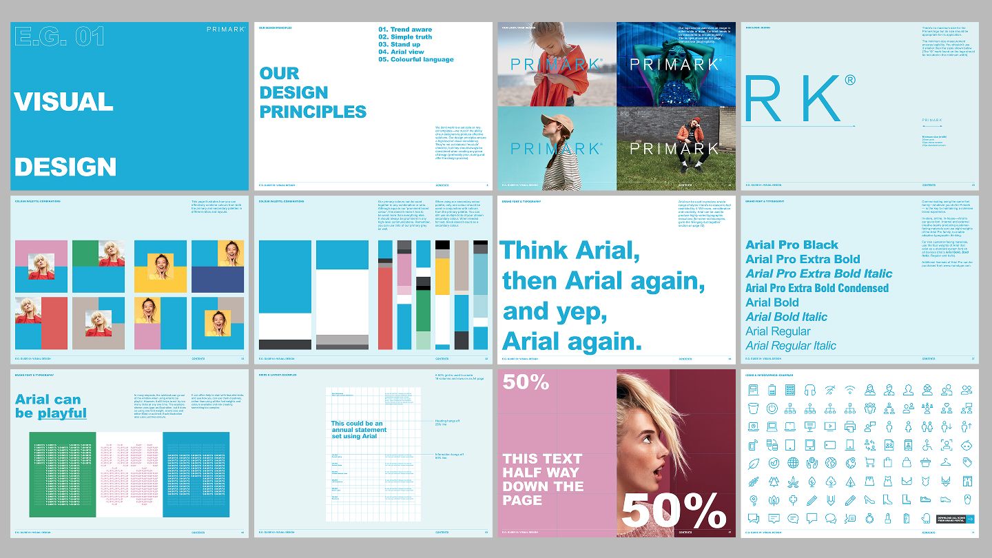
To support an internal launch, we created a series of "E.G. Guides". These offered guidance and inspiration for the many areas and teams within the business.

Flexibility and fun sat at the core, allowing the newly established brand assets to adapt to the wide-ranging requirements of the business.

As a business rooted in fashion, the brand book needed to provide creative guardrails, while still leaving room for interpretation and expression.
The brand’s 50th birthday celebrations provided another opportunity to stretch our new design system’s legs.

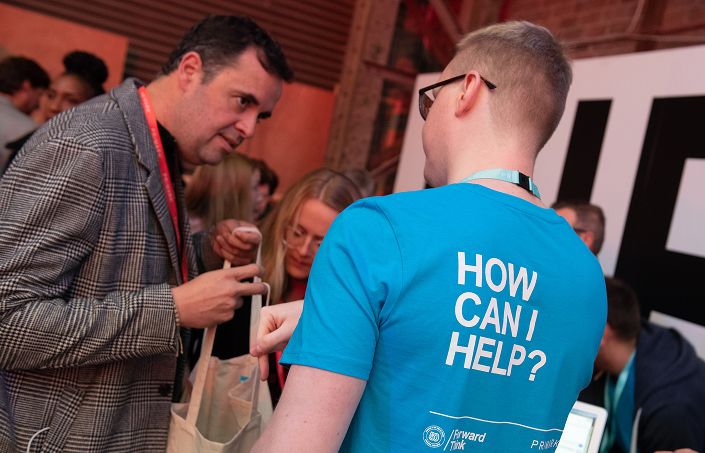
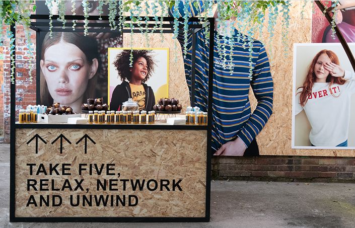
We created a sub-identity for the two-day event. This was implemented both digitally and environmentally: transforming a warehouse space in Birmingham for the occasion.

We created the sub-identity (and various collateral) for Primark’s fundraising partnership with UNICEF. As part of the project, some of our team members joined the delegation on a trip to Cambodia to document the impact the partnership had been making for disadvantaged children.
A new sub-brand and multi-channel campaign to launch Primark’s hotly anticipated move into online shopping.

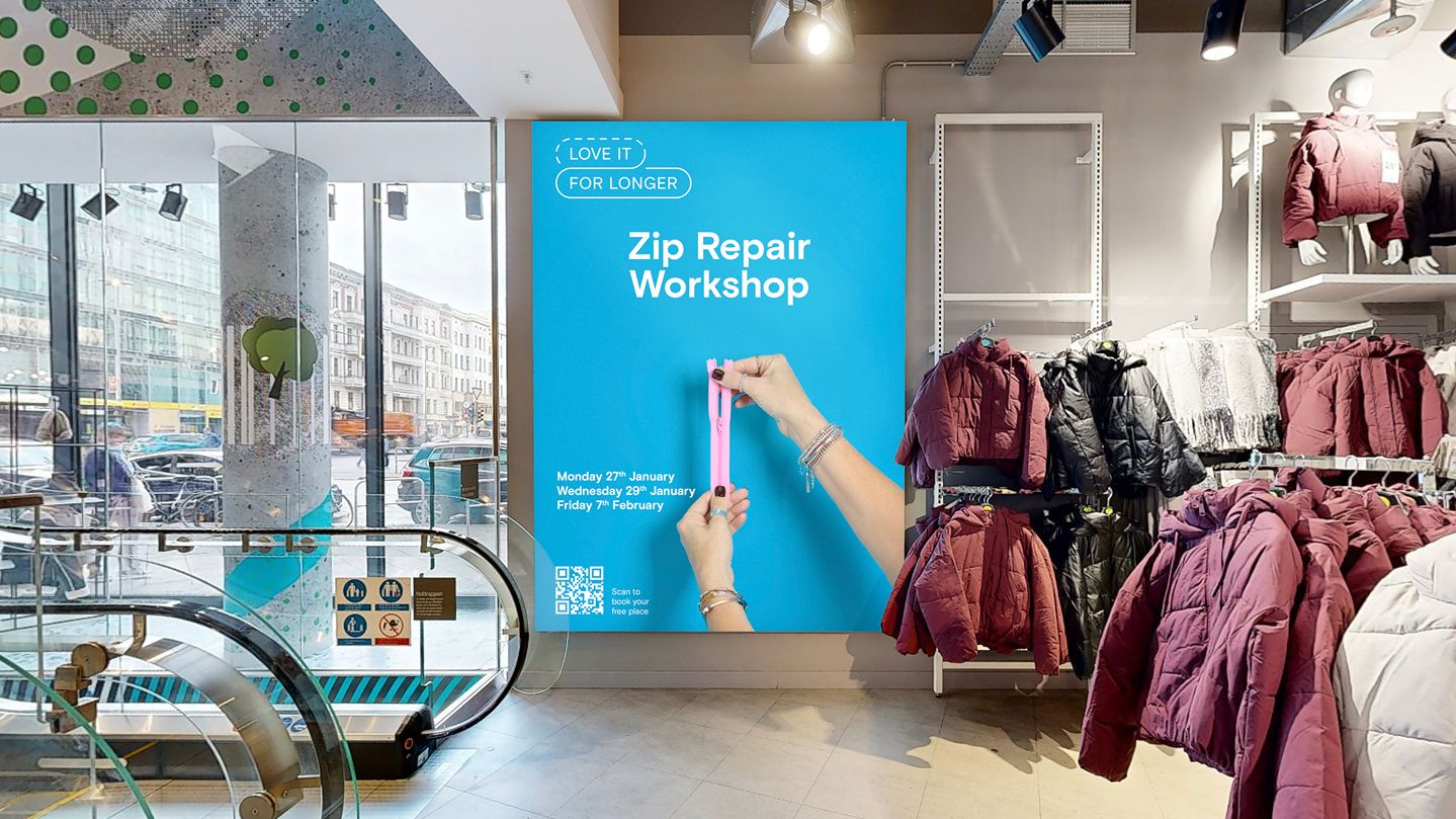
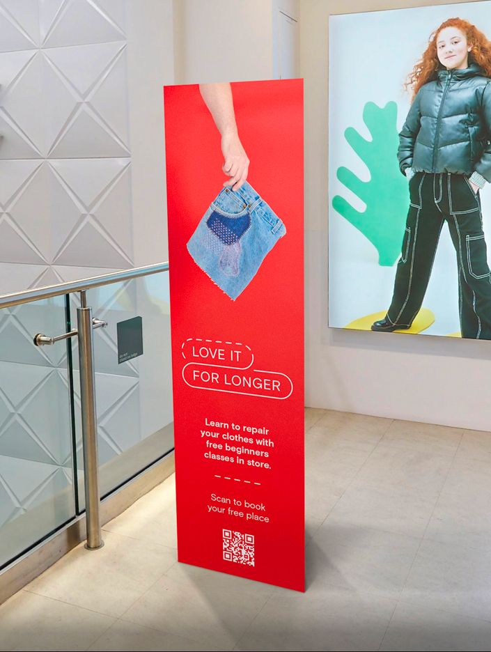
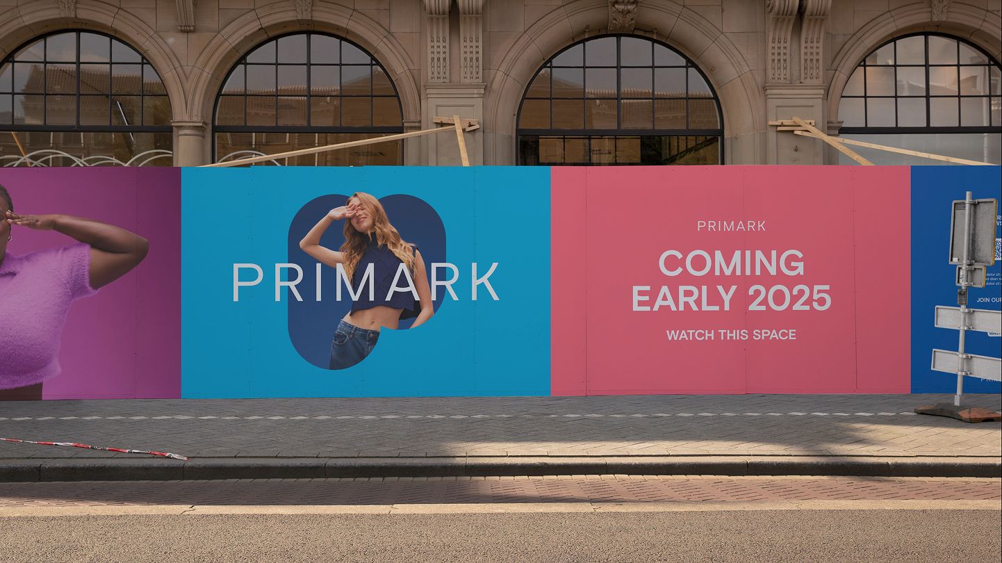
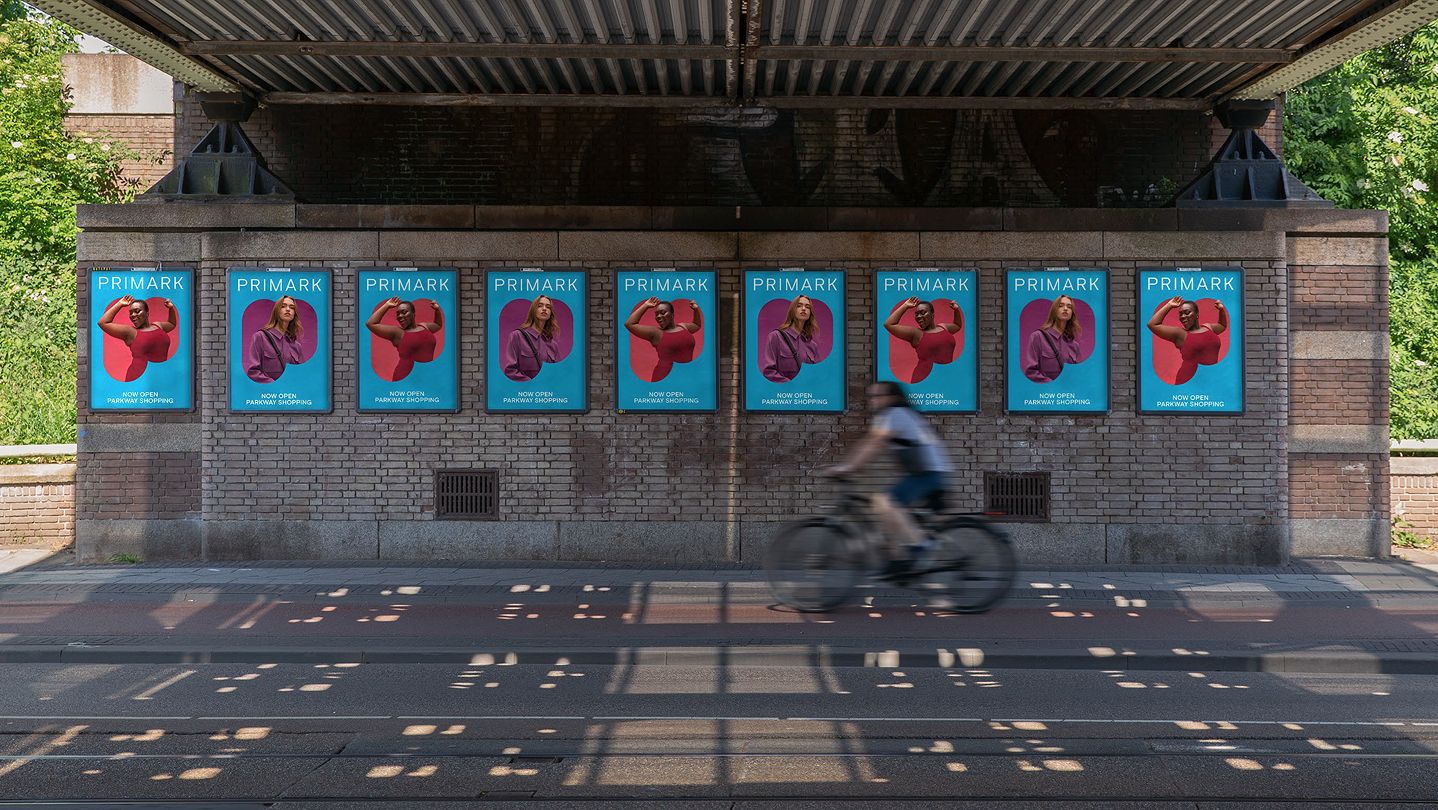
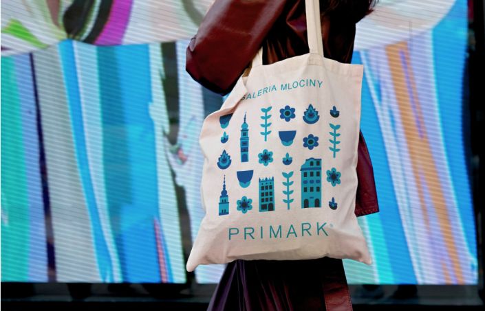
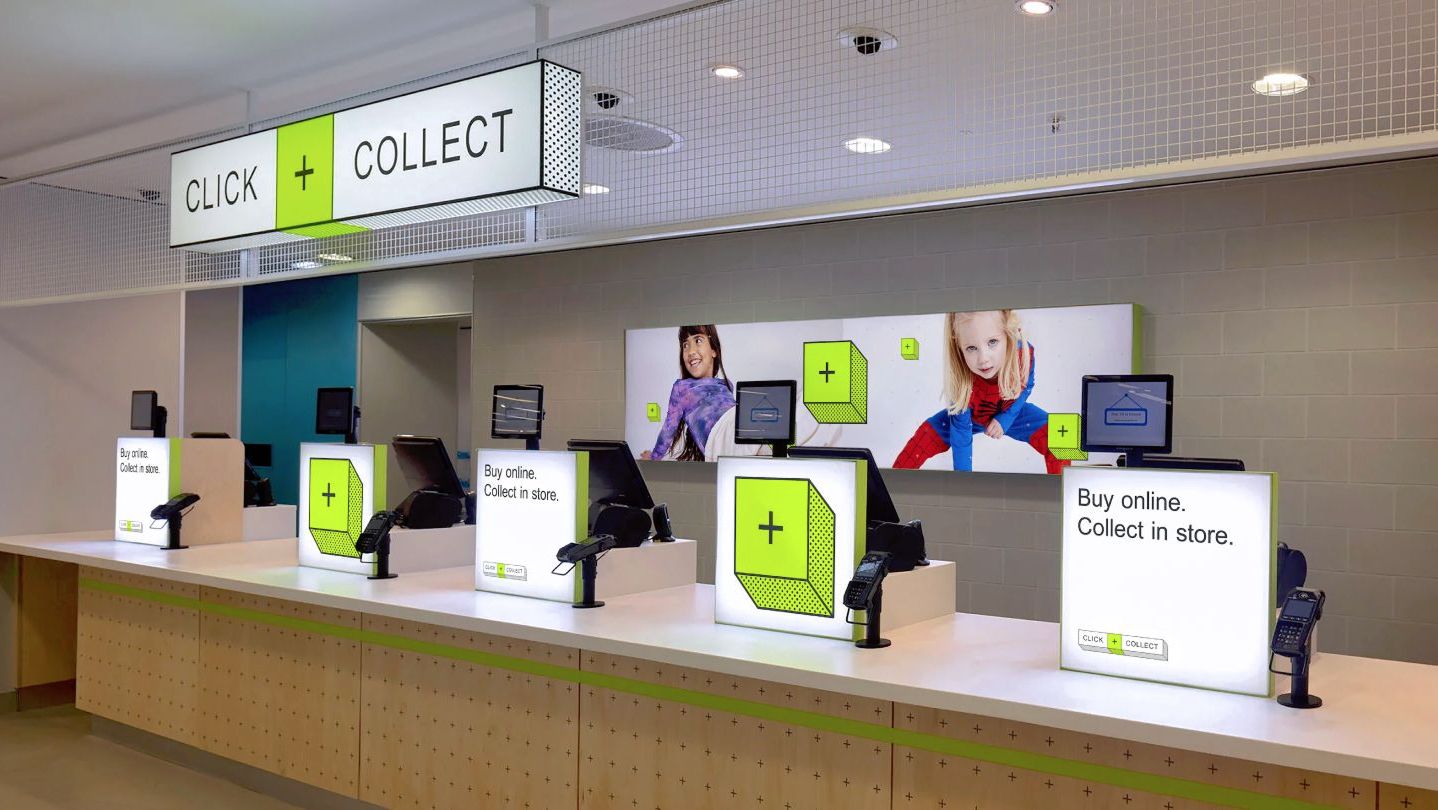
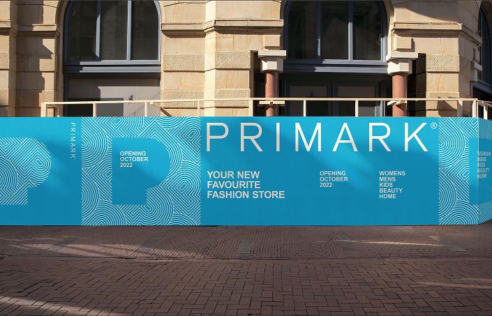
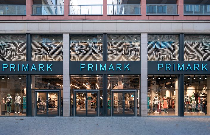
To create both stand-out and consistency across in-store and online, we introduced a new brand colour. Clean, graphic elements slot together into a modular design system that can be adapted to various applications.

Created to expand on Primark’s existing distinctive brand assets, the idea was to use the "P" of Primark as a visual shorthand for the brand. Over time, it was designed to become an instantly recognisable device (and a more creative asset than the primary wordmark).
In 2024, Primark added to its distinctive brand assets further: with a refreshed wordmark, custom typeface and "Portal".

Whilst we didn’t develop the new assets ourselves, we played—and continue to play—a key role in their application; determining how they're best used throughout the brand.

We were tasked with bringing this new brand world to life for Primark’s 2024 Christmas campaign.


Our two-part narrative: “You bring the joy. We bring the Primark” enabled the brand to help customers celebrate the little moments that often mean just as much as the big ones.

This Back To School campaign dialled up the fun, taking the new brand typeface and inflating it.

Illustration assets were created to inject an energy and childlike joy into the photography.

Simplicity was the order of the day here. Clean typography and the Pride colour palette provided a backdrop that allowed our cast members’ stories to take centre stage.
A campaign (and sub-brand) to encourage rewearing, remaking, and repairing your Primark products.

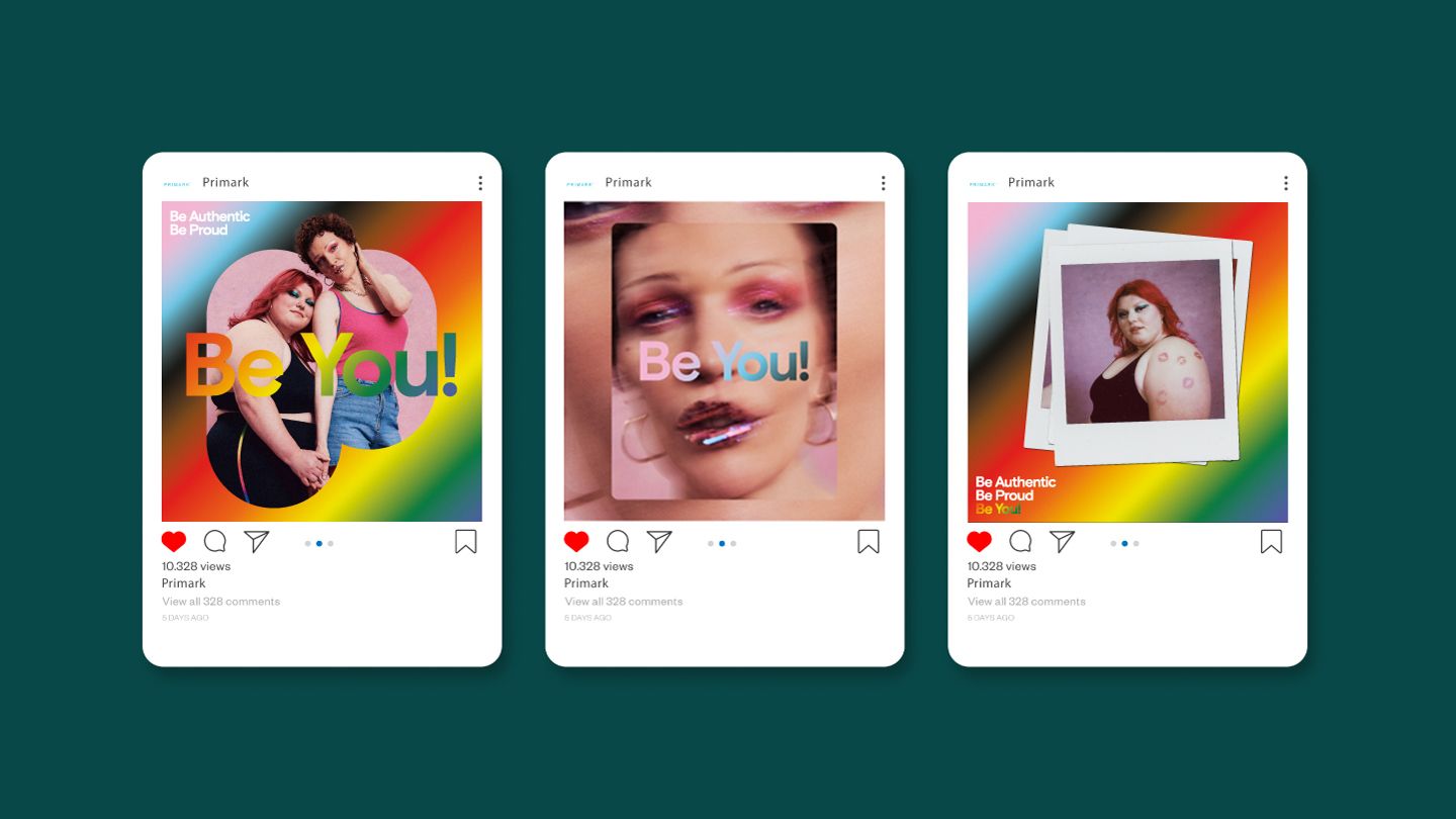
Simple, graphic photography enables the messaging to take centre stage.

Concept and Art Direction for a series of hero brand images, designed to celebrate Primark’s new Portal device and colour palette. Clean, bold and simple; the imagery (and design system) will be applied worldwide to support new store openings and bring more consistency to internal and external store environments.

Talk to Edna